Anyway, I thought I'd round up some of the big cover reveals that happened recently and share my thoughts. Let's start with the one and only cover that I did not like.
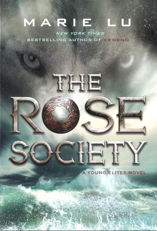
The Rose Society by Marie Lu - This cover was 100% disappointing. I was excited about seeing the cover because I enjoyed The Young Elites, the first book and the series, and was looking forward to the next installment but the cover was a major letdown. I mean, the book is called "The ROSE Society" so you would expect a rose on the cover or at least something red, right? The Young Elites is more vague so you can get away with a just putting dark clouds on the cover but putting waves and a wolf, with no flower in sight, on the cover of a book called The Rose Society... I was so so so disappointed with this. I'll still be reading the book but I'm not eager to buy it.
The good news is that all the other covers are actually pretty great. So let's move on to the good stuff, starting from least exciting to most exciting.
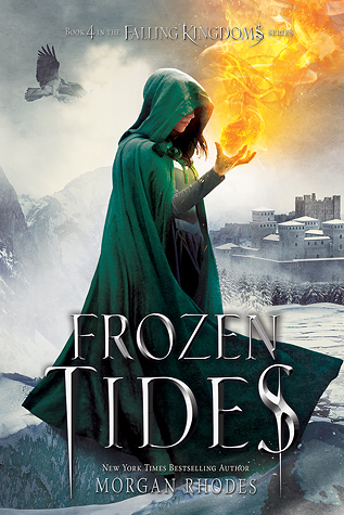
Frozen Tides by Morgan Rhodes - This is actually a really gorgeously awesome cover. The only reason it's the least exciting is because it's the fourth book in a series in which I'm still on the second book. The Falling Kingdoms series my Morgan Rhodes seems very exciting, and I say "seems" because I've only read the first book which is usually not enough to get a good grasp on a fantasy series, especially not a big, six book fantasy series like this one. I love the colors and the fire and the whole thing is just pretty.
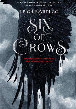
Six of Crows by Leigh Bardugo - The best thing about Leigh Bardugo's covers are the details and she did not disappoint with the cover of the first book in her new series, The Dregs. There's the wing that sort of, somehow, forms towers and it's mysterious yet also fantastical and it makes me wonder what the book is about. Which is kind of the point, right? The only downside is that the cover is black and grey and I feel like half the books in my shelf are black and grey. But a good book is a good book regardless of what the cover looks like and I will most definitely be reading this one come October.
Winter by Marissa Meyer - I guess I was lucky that I started reading the Lunar Chronicles late because I won't have to wait two years between Cress and Winter, but we finally got a cover for Winter which means the release date is in sight! I really like the cover! I love how the red of the apple really pops against the purple background. I was anticipating that the apple is what would be featured since it is the story of Snow White. Snow White doesn't really have an iconic clothing item or beauty feature like the other fairy tale characters in the story... well, I guess her rose red lips but they aren't nearly as iconic as the apple. Plus, the other covers have made a point of not showing the character's face so why start now? I feel like there needs to be some sort of preparation that needs to happen before reading this 800 page mammoth of a book.
And last, but most definitely not least, the most exciting book cover reveal of the year....(drum roll)...
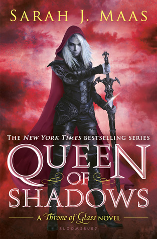
Queen of Shadows by Sarah J. Maas - First of all, wow! Wow. Wow. Wow. Can I please have this book yesterday!?! This is hands down, no doubt about it, my most anticipated book of the year. If you haven't started the Throne of Glass series, what in the world are you waiting for!?!?! This series is amazing and epic and heart breaking and wonderful and kick ass and perfect and magical and beautiful and story telling greatness and... really, I could go on and on. But, to sum it up, I will say that Sarah J. Maas is genius and Celaena Sardothien is my everything. Back to the cover. Isn't it pretty! Everytime I look it I start feeling like Gollum
Is that weird? Yes? Well, I don't care. I am obsessed with this series and I have no shame whatsoever in admitting it. Anyway... back to the cover, again. Does anyone else feel like the cover and Celaena in general has a different vibe on QoS than on the other books. I think so. And I love it! I love that she's about to wield that sword and she has this super calm face while doing it. On all the covers she looks ready to jump into a fight any second but this one she's so calm! Not in a not ready kind of way but in a "I'm so ready I don't even need to get into fighting stance" kind of way. Does that make sense? And I love that the background kind of resembles clouds because it seems more calm than the other covers where there was energy or fire exuding from her. The whole cover sort of screams "the calm before the storm" which is so perfect because... well, if you're caught up you'll know why.
Before I end this post I would like to declare Sarah J Maas the Queen of Beautiful Covers! This is an official title and cannot be disputed. That is that.
What did you think about these cover reveals? Which cover reveal is your favorite? What cover reveals are you looking forward to?


No comments:
Post a Comment